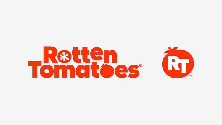
ROTTEN TOMATOES REBRAND
For almost 20 years, Rotten Tomatoes (fans’ go-to destination for entertainment reviews and information), hadn't changed much visually in terms of logo, iconography, and color palette. As head of creative for Rotten Tomatoes, I was given the immense responsibility and challenge of rebranding our visual identity for usage not only on our website, but for all other platforms that Rotten Tomatoes has extended its reach to - social, mobile, live events, broadcast, video, and partner platforms.
The goal was to create a visual identity that was modern, professional, and credible, but still maintaining the core ethos and brand essence of Rotten Tomatoes. We partnered with design legend Emily Oberman of Pentagram and her team over an extended period of time, which involved extensive testing with Rotten Tomatoes' passionate fans.
Press: AdWeek "Rotten Tomatoes Rolls Out a Fresh Logo and Visual Identity After 19 Years
___
+ creative direction
+ branding
Agency: Pentagram (Emily Oberman, Todd Goldstein)
